I create a good deal of media for my church, and sometimes that media needs to be used in many ways. Perhaps the event flier that I create for a pre-service loop of slides needs to also be made to fit social media, or be printed and handed out.
Up until recently I solved this issue by first designing something for the church’s presentation screen at a 16:9 ratio, then resizing and tweaking the design to meet whatever other needs where given to me. But no more! I have seen the light!
I had just read an article by Garrett Heath about creating “one image to rule them all”. The premise of the article is to design to one size specification that will look nice across all social media, taking into consideration the way that some media crop images. His explanation of how using a 1600 x 800 pixel image with a 160 pixels of padding on either side makes for a sharp image on most social media is really great.
I really liked the concept, but the media that the article focused on—Facebook, LinkedIn, Google+ and Twitter—didn’t cover all that I needed. For one, my church mainly uses Facebook and Instagram, leaving the other media described alone. Not only that, I still needed to be mindful of designs for the in-church screen as well as our tendency to print fliers for events that use the same design. Armed with my new idea and my use cases, I set out to implement a new workflow for church media creation.
Use Cases and Media Requirements
I knew that I needed something that would allow me to quickly and efficiently create print and screen media at once. It also needed to be expandable. Who knows what types of media I’ll need in the future? I had the starting point of Garrett’s idea, but wanted to expand on it. The aspect ratios I’d find most useful were:
- 2:1 for the scaling social media image, as well as a base for the design
- 16:9 for the church screen
- 1:1 for the small invite 3” square cards my church often prints
- 5:3 for the most likely size to need printing
- 6:4 for postcard-sized invites
I also knew that I wanted to employ the power of Photoshop Smart Objects to make the flow just a little more automated.
I knew my starting point would be the 2:1 ratio as it would allow me to create a base design that could be cropped and resized for several applications.
Garrett’s specification was great, but didn’t take into consideration that Facebook crops images into squares when they are viewed in an album. I wanted to remedy this. My solution was to add another 240 pixels of padding to each side, leaving a square in the middle.
I would begin a design, knowing that information needs to go in the center square. Designing with such a limited space will sometimes be a challenge, but I am always up for those.
Considering Instagram, I wasn’t worried. They’ve gotten rid of the forced 1:1 ratio on posts. I knew that whatever I designed would look fine, but the design building from a square outward would mean that even if we cropped the image to the Instagram characteristic square, it would work fine.
Creating the Base
I set about making my first aspect ratio, doubling the size of the artboard from 1600 x 800 pixels to 3200 x 1600 pixels. This allowed me to be sure all of the images I create are high enough resolution for all of the necessary sizes and uses. Here’s my new design base.

Base Template
And here’s what that looks like with a design underneath.

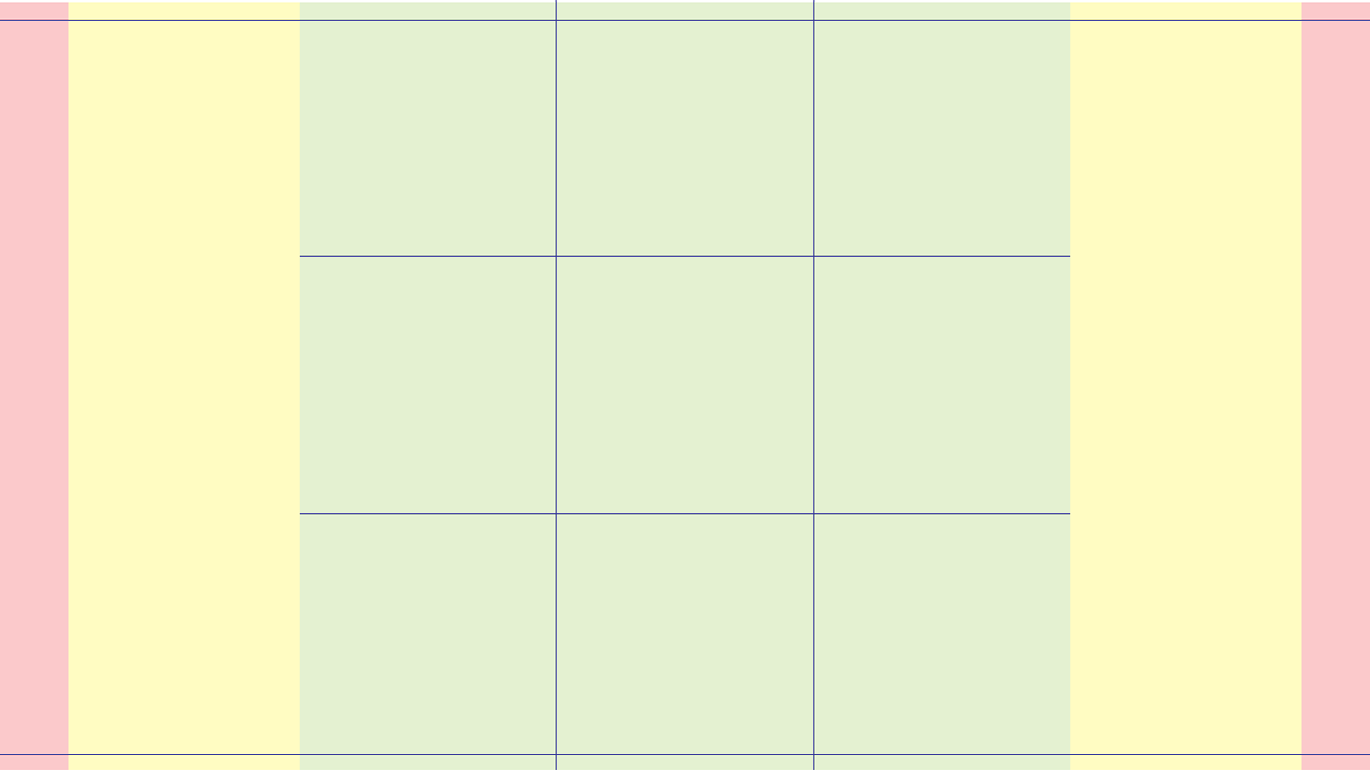
How the various guides are placed on the base template.
This image would allow me to design something that keeps the must-see information in the center green zone. Objects that are of pretty good visual interest, but do not add to the information at hand are allowed into the yellow zone. The red zone is a no-man’s land for info and should hold nothing that cannot be cut away. Sometimes I treat both the yellow and red zones as no-man’s land. This makes for a good image on all social media, even if we begin using Twitter and Google+.
Resize and Crop
This is all created in a Smart Object that covers the artboard. The color-coded zones and margin lines are on separate layer. The next step is to create artboards in the same .PSD with the appropriate sizes for my other use cases that reference that original Smart Object scaled and cropped to fit correctly.
My main consideration when cropping and resizing was that the entire artboard be covered with one dimension—usually the height—fitting exactly. After that, it was a matter of centering the design over the artboard, letting what bled off just be cut away.
For instance, when making the 16:9 ratio artboard I made sure that the height of 1080 pixels was exact and that the Smart Object kept its ratio. I then centered the design horizontally on the artboard, getting this:
All artboards were resized to one dimension and centered on the other.
The result is that 16:9 artboard shaves just a bit of the red zone away while the 1:1 artboard only holds on to the very center and most important part.
A Spoonful of Automation
The great thing about employing a Smart Object referenced on each artboard is that updates to the base artboard’s Smart Object change them all. The finished artboard looks something like this. I even include an artboard with a 1600 x 800 pixel size so that the social media posts we push aren’t quite so big.

All five necessary sizes are included automatically.
In the event that a new size is introduced, I can easily add it to the mix, knowing that as long as the center square makes it onto the artboard, all of the important information will be included. Here’s an example of one design for all the use cases. I tend to export them all quickly as PNGs or PDFs once I’ve finalized a design. Now I’m able to deliver the moment someone asks, “Hey, could you get me that flier in a 4 x 6 PDF for print?”
This document has greatly improved my workflow. If you’re interested in using this in your own workflow, feel free to click here to download the .PSD file . Let me know how you like it. Got something you’d do to improve it? I’m all ears. Leave a comment below.
comments powered by Disqus